THE CHALLENGE
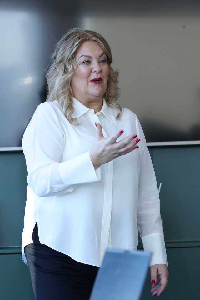
After 18 years supporting other businesses to grow, it was time for the Ruth Badger Consultancy to invest in their own. A name change to the abbreviated ‘RBC’ represented an exciting new chapter as they embarked on their mission to challenge the status quo when it comes to business growth consultancy. To coincide with a new strategic direction for the business, RBC also strengthened its leadership team appointing two new directors to make a total of four, equal, equity partners, all of which played a significant part throughout the branding process.
The solution
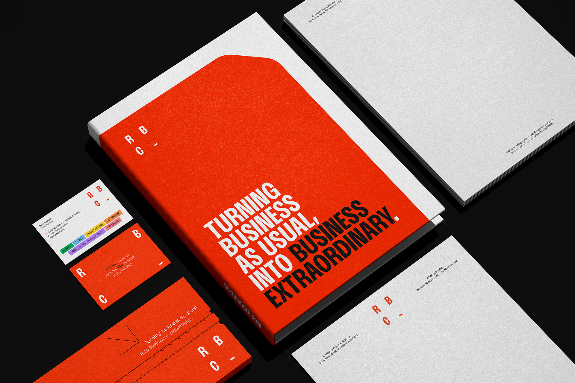
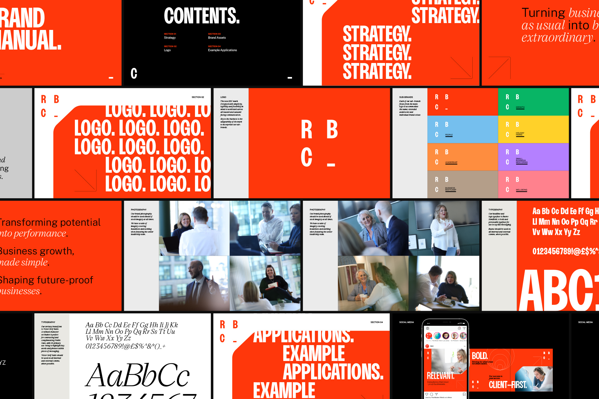
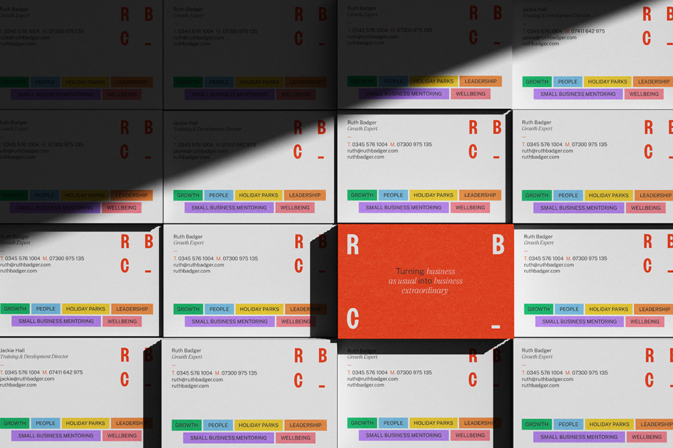
The project covered the full scope of brand elements. Once positioning was defined we developed a purpose statement, value proposition, brand story, values and behaviours, brand personality, tone of voice and a complete overhaul of the visual identity.
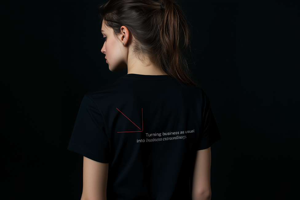
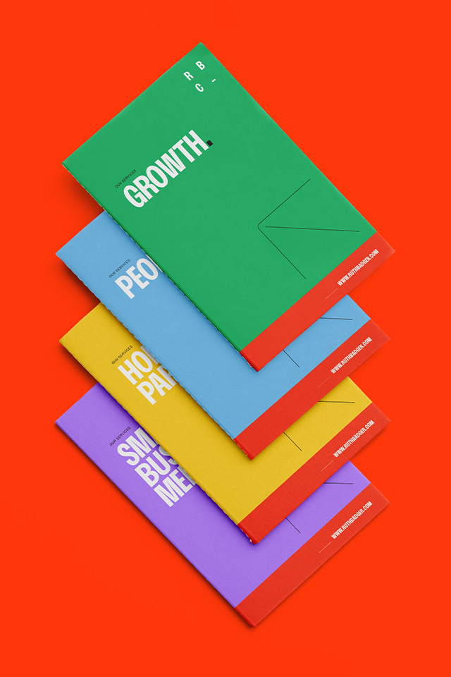
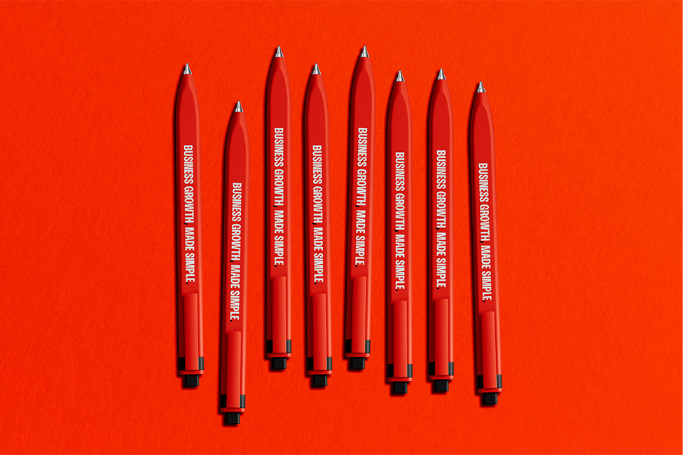
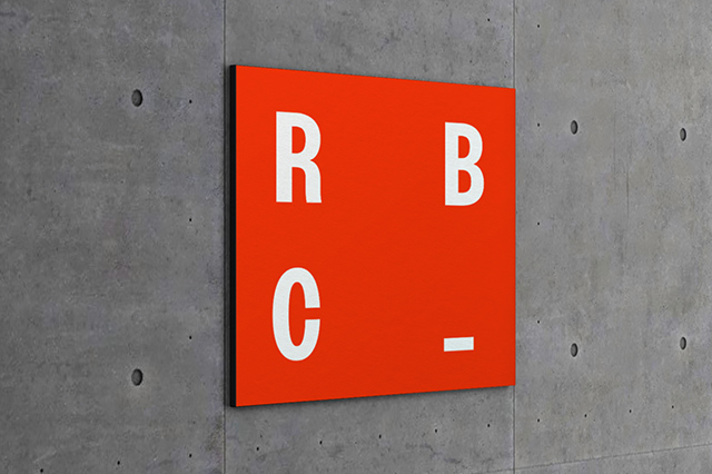
The original brand colour – red – had some equity and was retained, although made brighter and more vibrant. The tonal values of the supporting colour palette were then built around that to complement it, while also working independently where needed across the sub–brands. Typography plays a big part in the identity, with big, bold messaging at the heart of the RBC ‘rebels with a cause’ personality.
It’s time to turn business as usual into business extraordinary.
SCOPE
Branding
Website
Social Media
Print Collateral
Promotional Material
Launch Campaign
Social Media Campaign
Advertising
Copywriting



The Modern World’s approach was different to anything we’d experienced before – they were like a breath of fresh air. Working with them became more than just a rebrand – the stages they took us through seemed to empower us more and more. The clarity they gave us in how we describe who we are and what we do was incredible. Matt, Jen and the team were very patient with us, which is key when you have four, strong-minded women making decisions! We have had a great experience working with them, and are left with a brand, story and vision we all absolutely love!


